Chapter 2 Data wrangling and manipulation

Learning objectives
-
Import data into R from a
.csvfile using 1) functions and 2) via the menu -
Apply the principles of tidy data using the
tidyverseinR -
Carry out and interpret the outputs of basic exploratory data analysis using in-built
Rfunctions -
Carry out basic data wrangling techniques in
R(e.g., reshaping data, creating new variables, and aggregating information using functions such as thetidyversefunctionsmutate(),group_by(), andsummarize()). -
Implement
tidyversepipelines using the%>%(pipe) operator -
Create appropriate and communicate informative data visualizations using
R -
Map the appropriate data structure to a
ggplot2aesthetic - Identify the mapping of a variable given a plot
- Discuss and critique data visualizations
2.1 Exploratory data analysis and data wrangling in the Tidyverse
For this, and most other sections, we will be using the tidyverse, which is a collection of R packages that all share underlying design philosophy, grammar, and data structures. They are specifically designed to make data wrangling, manipulation, visualization, and analysis simpler.
To install all the packages that belong to the tidyverse run
## request (download) the tidyverse packages from the centralised library
install.packages("tidyverse")
To tell your computer to access the tidyverse functionality in your session run (Note you’ll have to do this each time you start up an R session):
## Get the tidyverse packages from our local library
## Do this every time you start a new session
## and want to use the tidyverse!
library(tidyverse)
2.1.1 The pipe operator
A nifty tidyverse tool is called the pipe operator %>%. The pipe operator allows us to combine multiple operations in R into a single sequential chain of actions.
Say you would like to perform a hypothetical sequence of operations on a hypothetical data frame x using hypothetical functions f(), g(), and h() (i.e., they are not actual R functions, but are shown to demonstrate the structure of a piping sequence):
This is where the pipe operator %>% comes in handy. %>% takes the output of one function and then “pipes” it to be the input of the next function. Furthermore, a helpful trick is to read %>% as “then” or “and then.” For example, you can obtain the same output as the hypothetical sequence of functions as follows:
## These functions are not true R functions but are
## shown to demonstrate the structure of a piping sequence
x %>%
  f() %>%
  g() %>%
  h()
You would read this sequence as:
- Take
xthen - Use this output as the input to the next function
f()then - Use this output as the input to the next function
g()then - Use this output as the input to the next function
h().
Let’s first read in the P\(\overline{\text{a}}\)ua data we looked at in the previous chapter:
library(tidyverse)
paua <- read_csv("https://raw.githubusercontent.com/STATS-UOA/databunker/master/data/paua.csv")
TASK Revisit the Dealing with data section in the previous chapter and make sure to practice reading the file into R using the different ways given. Make sure to restart R (i.e., close it down completely and open up a fresh clean workspace) each time.
Using a tidyverse pipeline we can calculate the mean Age of each Species in the paua dataset via
paua %>%
group_by(Species) %>%
summarize(mean_age = mean(Age))
## # A tibble: 2 × 2
##   Species            mean_age
##   <chr>                 <dbl>
## 1 Haliotis australis     7.55
## 2 Haliotis iris          4.40
You would read the sequence above as
- Take the
pauadata.frame then - Use this and apply the
group_by()function to group bySpecies - Use this output and apply the
summarize()function to calculate the mean (using (mean())Ageof each group (Species), calling the resulting numbermean_age
2.1.2 tidy data
“Tidy datasets are all alike, but every messy dataset is messy in its own way.”
There are three interrelated rules which make a dataset tidy:
- Each variable must have its own column
- Each observation must have its own row
- Each value must have its own cell
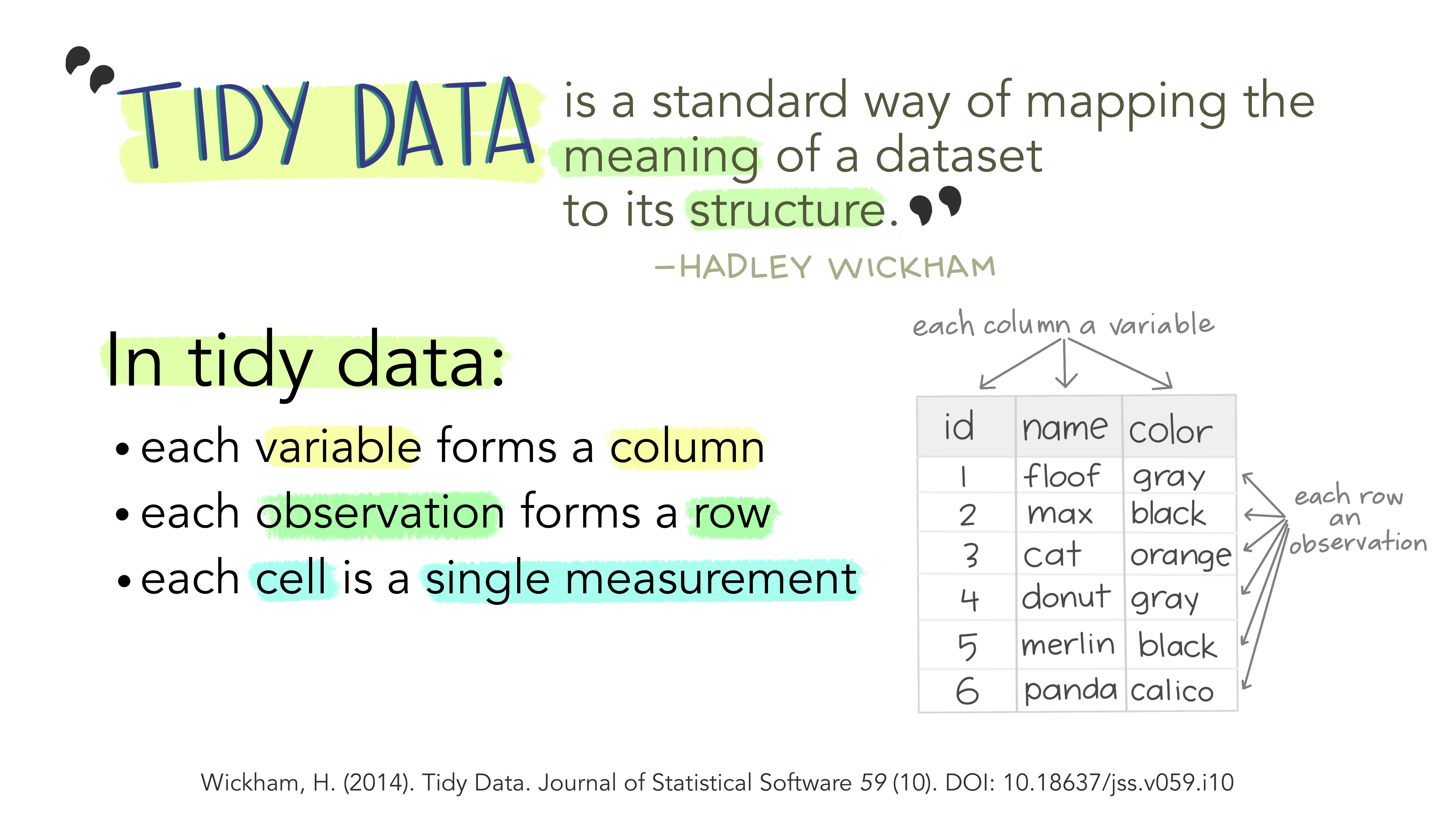
Illustration from the Openscapes blog Tidy Data for reproducibility, efficiency, and collaboration by Julia Lowndes and Allison Horst
Why ensure that your data is tidy? 1) Consistency: using a consistent format aids learning and reproducibility, and 2) simplicity: it’s a format that is well understood by R!
“Tidy datasets are easy to manipulate, model and visualize, and have a specific structure: each variable is a column, each observation is a row, and each type of observational unit is a table. This framework makes it easy to tidy messy datasets because only a small set of tools are needed to deal with a wide range of un-tidy datasets.”
2.1.3 Introuducing the Palmer penguins
library(palmerpenguins) ## this package contains some nice penguin data
penguins
## # A tibble: 344 × 8
##    species island    bill_length_mm bill_depth_mm flipper_length_mm body_mass_g
##    <fct>   <fct>              <dbl>         <dbl>             <int>       <int>
##  1 Adelie  Torgersen           39.1          18.7               181        3750
##  2 Adelie  Torgersen           39.5          17.4               186        3800
##  3 Adelie  Torgersen           40.3          18                 195        3250
##  4 Adelie  Torgersen           NA            NA                  NA          NA
##  5 Adelie  Torgersen           36.7          19.3               193        3450
##  6 Adelie  Torgersen           39.3          20.6               190        3650
##  7 Adelie  Torgersen           38.9          17.8               181        3625
##  8 Adelie  Torgersen           39.2          19.6               195        4675
##  9 Adelie  Torgersen           34.1          18.1               193        3475
## 10 Adelie  Torgersen           42            20.2               190        4250
## # ℹ 334 more rows
## # ℹ 2 more variables: sex <fct>, year <int>
So, what does this show us?
A tibble: 344 x 8: Atibbleis a specific kind of data frame inR. Thepenguindataset has344rows (i.e., 344 different observations). Here, each observation corresponds to a penguin.8columns corresponding to 3 variables describing each observation.species,island,bill_length_mm,bill_depth_mm,flipper_length_mm,body_mass_g,sex, andyearare the different variables of this dataset.
- We then have a preview of the first 10 rows of observations corresponding to the first 10 penguins. ``
... with 334 more rowsindicates there are 334 more rows to see, but these have not been printed (likely as it would clog our screen)
To learn more about the penguins read the paper that talks all about the data collection.
2.1.4 Common dataframe manipulations in the tidyverse, using dplyr and tidyr
Even from these first few rows of data we can see that there are some NA values. Let’s count the number of NAs. Remember the %>% operator? Here we’re going to be introduced to a few new things
- the
apply()function, - the
is.na()function, and - how
Rdeals withlogicalvalues!
library(tidyverse)
penguins %>%
  apply(.,2,is.na) %>%
  apply(.,2,sum)
##           species            island    bill_length_mm     bill_depth_mm
##                 0                 0                 2                 2
## flipper_length_mm       body_mass_g               sex              year
##                 2                 2                11                 0
There’s lot going on in that code! Let’s break it down
- Take
penguinsthen - Use
penguinsas an input to theapply()function (this is specified as the first argument using the.)- Now the
apply()function takes 3 arguments:- the data object you want it to apply something to (in our case
penguins) - the margin you want to apply that something to; 1 stands for rows and 2 stands for columns, and
- the function you want it to apply (in our case
is.na()).
- the data object you want it to apply something to (in our case
- So the second line of code is asking
Rto apply theis.na()function over the columns ofpenguinsis.na()asks for each value it’s fed is it anNAvalue; it returns aTRUEif so and aFALSEotherwise
- Now the
- The output from the first
apply()is then fed to the secondapply()(using the.). Thesum()function then add them up!Rtreats aTRUEas a 1 and aFALSEas a 0.
So how many NAs do you think there are!
Doesn’t help much. To
Now we know there are NA values throughout the data let’s remove then and create a new NA free version called penguins_nafree. There is a really handy tidyverse (dplyr) function for this!
penguins_nafree <- penguins %>% drop_na()
penguins_nafree
## # A tibble: 333 × 8
##    species island    bill_length_mm bill_depth_mm flipper_length_mm body_mass_g
##    <fct>   <fct>              <dbl>         <dbl>             <int>       <int>
##  1 Adelie  Torgersen           39.1          18.7               181        3750
##  2 Adelie  Torgersen           39.5          17.4               186        3800
##  3 Adelie  Torgersen           40.3          18                 195        3250
##  4 Adelie  Torgersen           36.7          19.3               193        3450
##  5 Adelie  Torgersen           39.3          20.6               190        3650
##  6 Adelie  Torgersen           38.9          17.8               181        3625
##  7 Adelie  Torgersen           39.2          19.6               195        4675
##  8 Adelie  Torgersen           41.1          17.6               182        3200
##  9 Adelie  Torgersen           38.6          21.2               191        3800
## 10 Adelie  Torgersen           34.6          21.1               198        4400
## # ℹ 323 more rows
## # ℹ 2 more variables: sex <fct>, year <int>
Below are some other useful manipulation functions; have a look at the outputs and run them yourselves and see if you can work out what they’re doing.
filter(penguins_nafree, island == "Torgersen" )
## # A tibble: 47 × 8
##    species island    bill_length_mm bill_depth_mm flipper_length_mm body_mass_g
##    <fct>   <fct>              <dbl>         <dbl>             <int>       <int>
##  1 Adelie  Torgersen           39.1          18.7               181        3750
##  2 Adelie  Torgersen           39.5          17.4               186        3800
##  3 Adelie  Torgersen           40.3          18                 195        3250
##  4 Adelie  Torgersen           36.7          19.3               193        3450
##  5 Adelie  Torgersen           39.3          20.6               190        3650
##  6 Adelie  Torgersen           38.9          17.8               181        3625
##  7 Adelie  Torgersen           39.2          19.6               195        4675
##  8 Adelie  Torgersen           41.1          17.6               182        3200
##  9 Adelie  Torgersen           38.6          21.2               191        3800
## 10 Adelie  Torgersen           34.6          21.1               198        4400
## # ℹ 37 more rows
## # ℹ 2 more variables: sex <fct>, year <int>
summarise(penguins_nafree, average_bill_length = mean(bill_length_mm))
## # A tibble: 1 × 1
##   average_bill_length
##                 <dbl>
## 1                44.0
group_by(penguins_nafree, species)
## # A tibble: 333 × 8
## # Groups:   species [3]
##    species island    bill_length_mm bill_depth_mm flipper_length_mm body_mass_g
##    <fct>   <fct>              <dbl>         <dbl>             <int>       <int>
##  1 Adelie  Torgersen           39.1          18.7               181        3750
##  2 Adelie  Torgersen           39.5          17.4               186        3800
##  3 Adelie  Torgersen           40.3          18                 195        3250
##  4 Adelie  Torgersen           36.7          19.3               193        3450
##  5 Adelie  Torgersen           39.3          20.6               190        3650
##  6 Adelie  Torgersen           38.9          17.8               181        3625
##  7 Adelie  Torgersen           39.2          19.6               195        4675
##  8 Adelie  Torgersen           41.1          17.6               182        3200
##  9 Adelie  Torgersen           38.6          21.2               191        3800
## 10 Adelie  Torgersen           34.6          21.1               198        4400
## # ℹ 323 more rows
## # ℹ 2 more variables: sex <fct>, year <int>
Often we want to summarise variables by different groups (factors). Below we
- Take the
penguins_nafreedata then - Use this and apply the
group_by()function to group byspecies - Use this output and apply the
summarize()function to calculate the mean (using (mean()) bill length (bill_length_mm) of each group (species), calling the resulting numberaverage_bill_length
penguins_nafree %>%
  group_by(species) %>%
  summarise(average_bill_length = mean(bill_length_mm))
## # A tibble: 3 × 2
##   species   average_bill_length
##   <fct>                   <dbl>
## 1 Adelie                   38.8
## 2 Chinstrap                48.8
## 3 Gentoo                   47.6
We can also group by multiple factors, for example,
penguins_nafree %>%
  group_by(island,species) %>%
  summarise(average_bill_length = mean(bill_length_mm))
## # A tibble: 5 × 3
## # Groups:   island [3]
##   island    species   average_bill_length
##   <fct>     <fct>                   <dbl>
## 1 Biscoe    Adelie                   39.0
## 2 Biscoe    Gentoo                   47.6
## 3 Dream     Adelie                   38.5
## 4 Dream     Chinstrap                48.8
## 5 Torgersen Adelie                   39.0
What about getting more complicated?
I suggest you run the code below one pipe at a time to work out what each function is doing and data it is acting on.
penguins_nafree %>%
  filter(., sex != "male") %>%
  select(c("species", "island", "body_mass_g")) %>%
  group_by(species, island) %>%
  summarise(total_mass_g = sum(body_mass_g)) %>%
  pivot_wider(names_from = c(island), values_from = total_mass_g)
## # A tibble: 3 × 4
## # Groups:   species [3]
##   species   Biscoe  Dream Torgersen
##   <fct>      <int>  <int>     <int>
## 1 Adelie     74125  90300     81500
## 2 Chinstrap     NA 119925        NA
## 3 Gentoo    271425     NA        NA
2.2 Data Visualization
“…have obligations in that we have a great deal of power over how people ultimately make use of data, both in the patterns they see and the conclusions they draw.”
“Clutter and confusion are not attributes of data - they are shortcomings of design.”
“Scientific visualization is classically defined as the process of graphically displaying scientific data. However, this process is far from direct or automatic. There are so many different ways to represent the same data: scatter plots, linear plots, bar plots, and pie charts, to name just a few. Furthermore, the same data, using the same type of plot, may be perceived very differently depending on who is looking at the figure. A more accurate definition for scientific visualization would be a graphical interface between people and data.”
“message and readability of the figure is the most important aspect while beauty is only an option”
2.2.1 Exploratory plots (for your own purposes)
Exploratory plots are just for you, they focus solely on data exploration. They
- Don’t Have to Look Pretty: These plots are only needed to reveal insights.
- Just Needs to Get to the Point: Keep the plots concise and straightforward. Avoid unnecessary embellishments or complex formatting.
- Explore and Discover New Data Facets: Use exploratory plots to uncover hidden patterns, trends, or outliers in the data. Employ different plot types to reveal various facets and aspects of the dataset.
- Help Formulate New Questions: Use exploratory plots as a tool to prompt new questions and hypotheses. As you discover patterns, think about what additional questions these findings raise for further investigation.
Let’s use a base R command (i.e., functions shipped with R) to create a boxplot of our paua data.
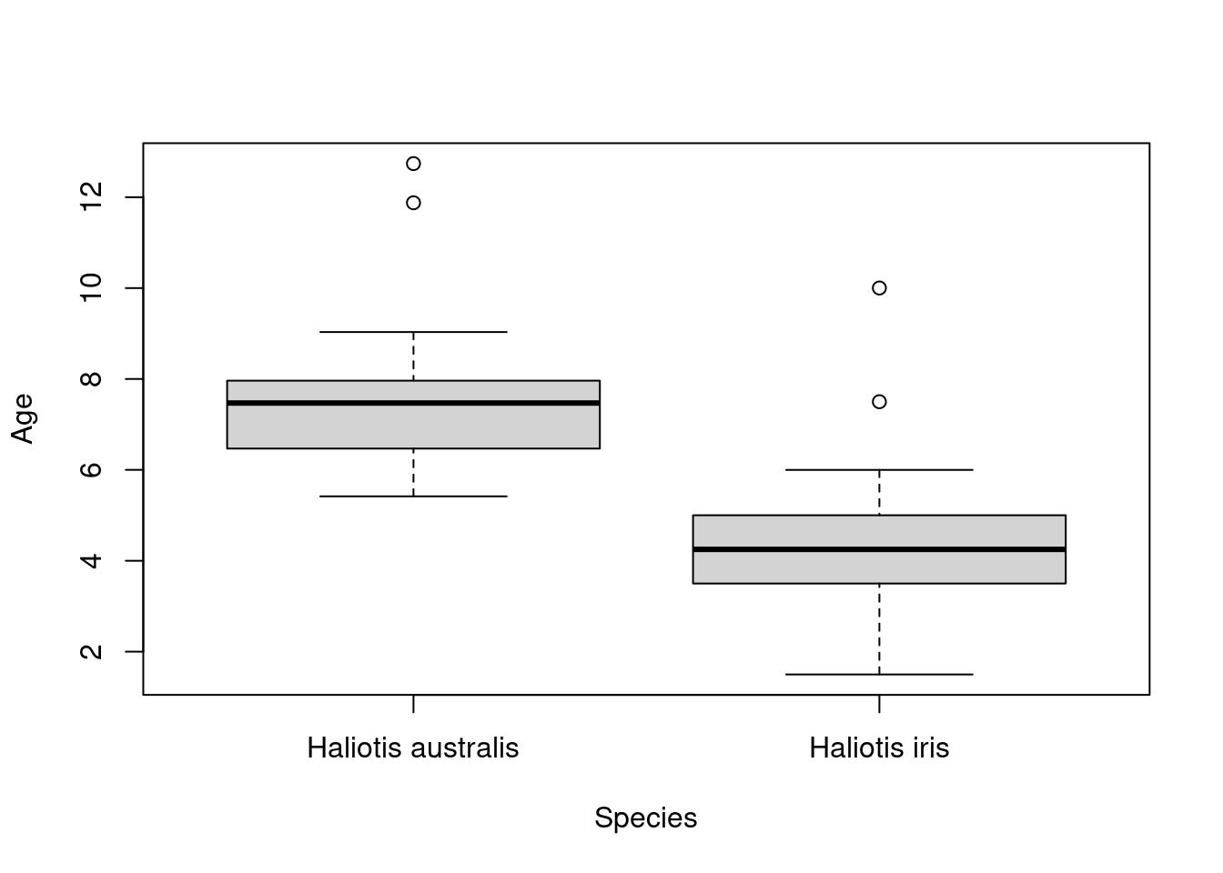
So what have we asked our computer to do here? We are using the function boxplot() and supplying two arguments: Age ~ Species, and data = paua. The first argument Age ~ Species is how R understands equations (e.g., \(y = x\)) and is asking for the variable Age to be plotted by the variable Species. The second argument data = paua specifies from which data object to grab the variables from (in this case the paua object we created above).
2.2.2 Explanatory plots
Explanatory plots are mainly for others. These are the most common kind of graph used in scientific publications. They should
- Have a Clear Purpose: Define a clear and specific purpose for your plot. Identify what scientific question or hypothesis the plot is addressing. Avoid unnecessary elements that do not contribute to this purpose.
- Be Designed for the Audience: Tailor the design of your plot to the characteristics and expertise of your audience. Consider their familiarity with technical terms, preferred visualizations, and overall scientific background.
- Be Easy to Read: Prioritize readability by using legible fonts, appropriate font sizes, and clear labels. Ensure that the axes are well-labeled, and use a simple and straightforward layout. Avoid clutter and unnecessary complexity that could hinder comprehension.
- Not Distort the Data: Maintain the integrity of the data by avoiding distortion in your plot. Ensure that scales and proportions accurately represent the underlying data, preventing misleading visualizations.
- Help Guide the Reader to a Particular Conclusion: Structure your plot in a way that guides the reader toward the intended conclusion. Use visual elements such as annotations, arrows, or emphasis to highlight key findings and lead the reader through the data interpretation process.
- Answer a Specific Question:Construct your plot with a specific research question in mind. The plot should directly address and answer this question, providing a clear and unambiguous response.
- Support an Outlined Decision: If the plot is intended to support decision-making, clearly outline the decision or action it is meant to inform. The plot should provide relevant information that aids in making well-informed decisions based on the presented data.
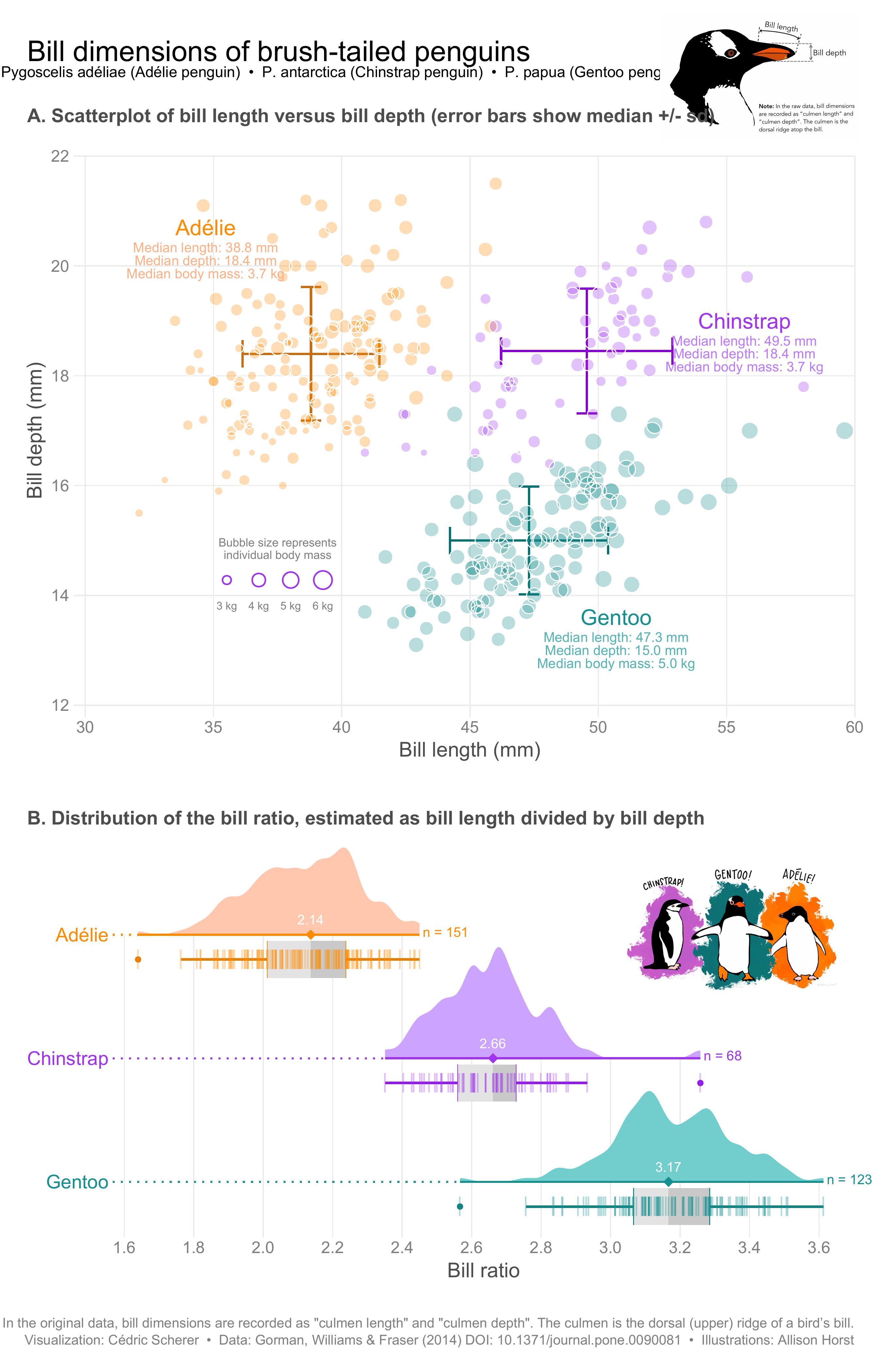
Plots by Cedric Scherer and mentioned on this blog
The table below summarises Ten Simple Rules for Better Figures, a basic set of rules to improve your visualizations.
| Rule Name | Rule Description |
|---|---|
| Know Your Audience | Understand the characteristics and expertise of your audience to tailor the figure accordingly. |
| Identify Your Message | Clearly define the main message or takeaway that you want the audience to understand from the figure. |
| Adapt the Figure to the Support Medium | Tailor the figure’s complexity and design to suit the medium it will be presented in (e.g., print, online). |
| Captions Are Not Optional | Craft informative captions that provide essential details and context for interpreting the figure. |
| Do Not Trust the Defaults | Adjust default settings to optimize the visual elements of the figure, such as colors, scales, and labels. |
| Use Color Effectively | Apply color purposefully, taking into account accessibility considerations and cultural interpretations. |
| Do Not Mislead the Reader | Avoid creating misleading visualizations and be aware of formulas to measure the potential misleading nature of a graph. There are formulas to measure how misleading a graph is! |
| Avoid Chartjunk | Eliminate unnecessary decorations and embellishments in the figure that do not contribute to the message. |
| Message Trumps Beauty | Prioritize conveying a clear message over making the figure aesthetically pleasing. |
| Get the Right Tool | Choose the appropriate visualization tool (e.g., R) or chart type that best communicates the data and intended message. |
TASK Read this short paper and find examples in your choice of literature of one or more of the rules in action.
2.3 Plotting using ggplot2
ggplot2 is an R package for producing statistical, or data, graphics; it has an underlying grammar based on the Grammar of Graphics

Every ggplot2 plot has three key components:
data,A set of
aesthetic mappings between variables in the data and visual properties, andAt least one layer which describes how to render each observation. Layers are usually created with a
geom_*function.
Every plot created using ggplot2 code requires the three components above:
library(ggplot2) ## load package
ggplot(data = <your_data>, aes(<specify_aesthetics>)) + ## initialize plot specifying data and aesthetics
    geom_<specify_geom>() ## add a layer (or geom)
Note the + operator used to add a layer onto a ggplot object (see below for examples), it has a specific purpose in a ggplot2 context. It should not be confused with the pipe operator %>% which takes the output of one function and passes it as the first argument to the next function (see The pipe operator).
The table below summaries the most common geoms and gives examples of when they are most likely appropriate.
geom_* |
Description | Typical Use Case | Mapping Aesthetics |
|---|---|---|---|
geom_point |
Displays individual data points as dots on the plot. | Visualizing individual data points in a scatter plot. | aes(x = ..., y = ...): X and Y coordinates. |
geom_line |
Connects data points with lines, useful for showing trends or relationships between continuous variables. | Representing trends or relationships over continuous variables. | aes(x = ..., y = ...): X and Y coordinates. |
geom_bar |
Creates bar charts, displaying the frequency or count of data within categorical groups. | Illustrating the distribution of categorical data. | aes(x = ..., y = ...): X-axis (categorical) and Y-axis (count or frequency). |
geom_histogram |
Constructs histograms, visualizing the distribution of continuous variables by dividing them into bins. | Examining the distribution of a single continuous variable. | aes(x = ..., y = ...): X-axis (continuous) and Y-axis (count or frequency). |
geom_boxplot |
Generates box plots, illustrating the distribution of a continuous variable and highlighting outliers. | Summarizing the distribution of continuous variables. | aes(x = ..., y = ...): X-axis (categorical) and Y-axis (continuous). |
geom_area |
Fills the area between a line and the x-axis, useful for visualizing accumulated quantities or proportions. | Depicting cumulative or proportional relationships. | aes(x = ..., y = ...): X and Y coordinates. |
geom_text |
Adds text labels to the plot, providing additional information about specific data points. | Annotating specific points or adding labels to the plot. | aes(x = ..., y = ..., label = ...): X, Y coordinates, and text labels. |
geom_smooth |
Fits and overlays a smoothed line (e.g., LOESS or linear regression) on the data points. | Highlighting trends and capturing patterns in the data. | aes(x = ..., y = ...): X and Y coordinates. |
geom_violin |
Produces violin plots, displaying the distribution of a continuous variable across different categories. | Visualizing the distribution and density of data within categories. | aes(x = ..., y = ...): X-axis (categorical) and Y-axis (continuous). |
geom_segment |
Draws line segments between specified points, useful for indicating relationships or connections in the data. | Illustrating relationships between two sets of coordinates. | aes(x = ..., y = ..., xend = ..., yend = ...): Start and end coordinates for the segments. |
2.3.1 Plotting the palmerpenguins data
You might find this application useful
Recall we used specified an NA-free version of the dataset:
First off, let’s create a scatter plot. The code below takes the penguins_nafree dataset (created above) and maps the body mass variable body_mass_g to the x-axis and flipper length variable flipper_length_mm to the y-axis. Then, it adds points to the plot to represent each data point in the dataset. Therefore, the plot shows the relationship between body mass (g) and flipper length (mm) for the penguins in our dataset penguins_nafree.
ggplot(penguins_nafree,aes(x = body_mass_g, y = flipper_length_mm)) + ## data & aesthetics
    geom_point() ## geom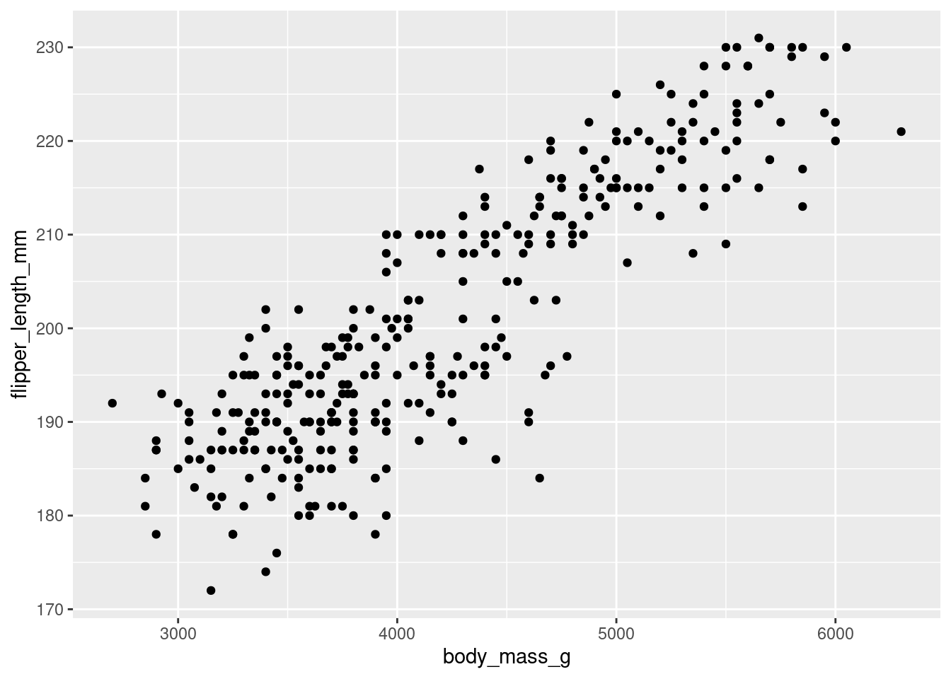
Breaking the code above down we have
ggplot(penguins_nafree, aes(x = body_mass_g, y = flipper_length_mm))initializes the plot using theggplot()function. It specifies the data framepenguins_nafreeand the aesthetics mapping: setting the x-axis (x) to thebody_mass_gvariable and the y-axis (y) to theflipper_length_mmvariable.- We then add (using the
+operator) a layer to the plot usinggeom_point(), which specifies that the data points should be represented as points on the plot. Each point corresponds to a row in the dataset, withxandycoordinates determined by the aesthetics specified in the previous line.
But, what about adding some personal touches? We can add more appropriate axis labels can be specified using xlab() and ylab() and even customizes the color scale using scale_color_manual():
ggplot(data = penguins_nafree, aes(x = bill_length_mm, y = bill_depth_mm)) +
  geom_point(aes(color = species),size = 2)  +
  scale_color_manual(values = c("darkorange","darkorchid","cyan4"), name = "") +
  xlab("Bill length (mm)") +
  ylab("Bill depth (mm)")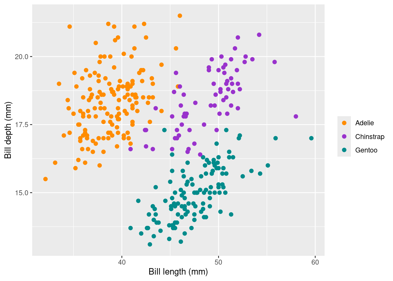
Breaking down the lines of code here we have that
- Again
ggplot(penguins_nafree, aes(x = body_mass_g, y = flipper_length_mm))initializes the plot using theggplot()function. It specifies the data framepenguins_nafreeand the aesthetics mapping: setting the x-axis (x) to thebody_mass_gvariable and the y-axis (y) to theflipper_length_mmvariable. geom_point(aes(color = species), size = 2)adds a layer to the plot usinggeom_point(). It specifies that the data points should be represented as points on the plot. The argumentaes(color = species)argument the species variable to the color of the points, andsize = 2sets the size of the points.scale_color_manual(values = c("darkorange","darkorchid","cyan4"), name = "")customizes the color scale of the points by setting the manually via the argumentvalues = c("darkorange","darkorchid","cyan4"). Here the three specified colors are used for the three different species of penguins passed on from the previous aesthetic. The argumentname = ""removes the legend title.- Finally
xlab("Bill length (mm)")andylab("Bill depth (mm)")manually set the x-axis and y-axis labels.
scale_color_manual() in the code above. Research Hex colour codes and try using these instead of colour names.
Now let’s move onto plotting different types of data (e.g., continuous and discrete) on the same plot. We can even add some easy custom themeing using in-built ggplot2 functionality (e.g., theme_classic()). The code below, generates a boxplot that compares the distribution of flipper lengths (mm) for the different penguin species.
## boxplot
ggplot(penguins_nafree,aes(x = species, y = flipper_length_mm)) +
    geom_boxplot() +
    ylab("Flipper length (mm)") + xlab("") +
theme_classic() 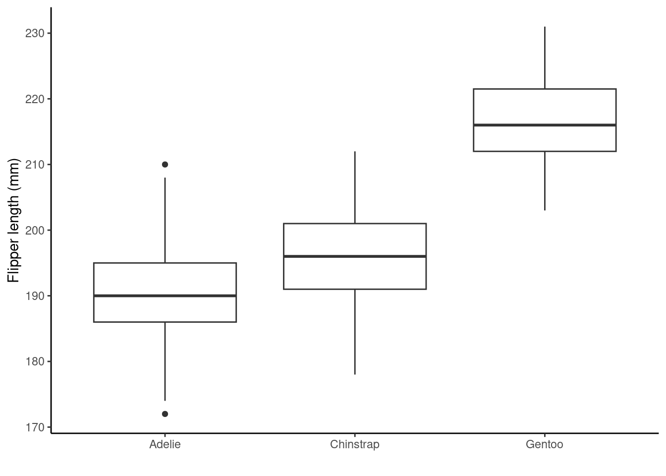
Breaking the code above down we have
ggplot(penguins_nafree, aes(x = species, y = flipper_length_mm))initializes the plot using theggplot()function. It uses thepenguins_nafreedataset and sets the x-axis (x) to thespeciesvariable and the y-axis (y) to theflipper_length_mmvariable.geom_boxplot()adds a layer to the plot creating boxplots for each level of thespecies(x-axis) variable (species).ylab("Flipper length (mm)") + xlab("")manually set the y-axis label to"Flipper length (mm)"and remove the x-axis label (setting it to an empty string"").theme_classic()applies the so called classic theme to the plot, changing the appearance of the background and gridlines etc. from the default ones above.
TASK
Type theme_ into your Console and wait for RStudio to attempt to autocomplete for you. Run down the list of in-built themes and try them instead of theme_classic() above.
Rather than a boxplot we are going to create a violin plot of the same variables using geom_violin() (we use another theme this time theme_minimal()). Violin plots are more flexible than boxplots as they better show the shape (i.e., distribution) of our data.
## violin plot
ggplot(penguins_nafree,aes(x = species, y = flipper_length_mm)) +
    geom_violin() +
    ylab("Flipper length (mm)") + xlab("") +
    theme_minimal() ## another theme...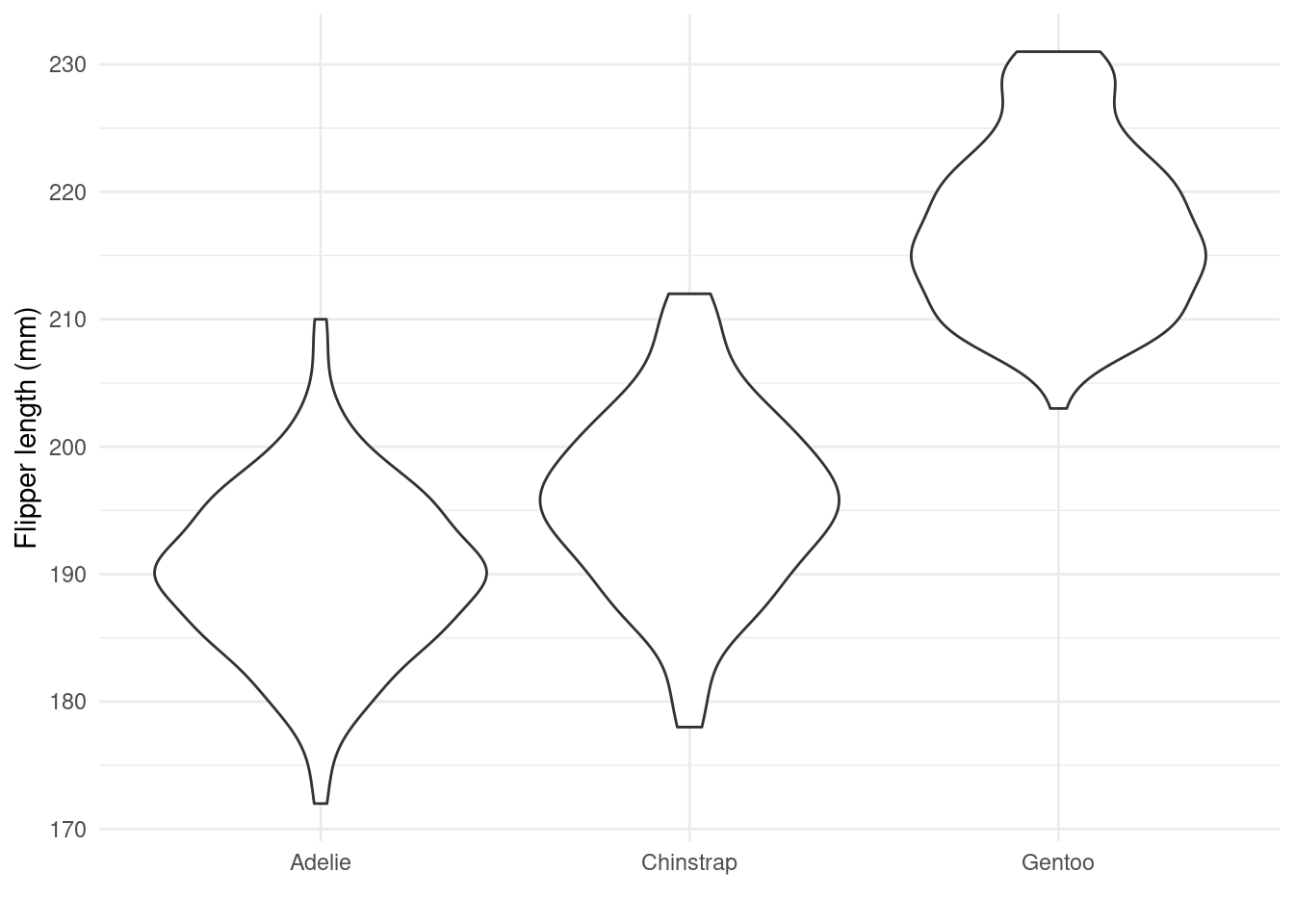
TASK What can you say about the distribution of penguin flipper length. Do you this the distributions are symmetrical, skewed, bimodal?
The code below plots a histogram of flipper lengths (mm) for penguins, with different colors representing different species. We make the colours transparent using the alpha argument so that we can see the overlap in distributions. There are also another couple of new functions and arguments used, breaking the code down line by line we have
ggplot(penguins_nafree, aes(x = flipper_length_mm))initializes the plot using theggplot()function. We specify thepenguins_nafreedataset and map the x-axis (x) to theflipper_length_mmvariable.geom_histogram(aes(fill = species), alpha = 0.5, position = "identity")adds a layer to the plot usinggeom_histogram(), which creates a histogram of flipper lengths. Theaes(fill = species)argument colors the bars based on thespeciesvariable. Settingalpha = 0.5adjusts the transparency (which ranges from 0 to 1) of the bars. Finally, the less obvious use of andposition = "identity"places the bars directly adjacent to each other.xlab("Flipper length (mm)")sets the x-axis label.scale_fill_brewer(palette = "Dark2", name = "Species")specifies a custom color scale mapped to the fill aesthetic. It sets the color palette to"Dark2"and assigns the legend title as"Species".theme_light()sets another in-built theme changing the appearance of the background and gridlines etc.
## histogram, with a colorblind friendly palette
ggplot(penguins_nafree,aes(x = flipper_length_mm)) +
    geom_histogram(aes(fill = species), alpha = 0.5, position = "identity") +
    xlab("Flipper length (mm)") +
    scale_fill_brewer(palette = "Dark2", name = "Species") +
  theme_light() ## and another theme....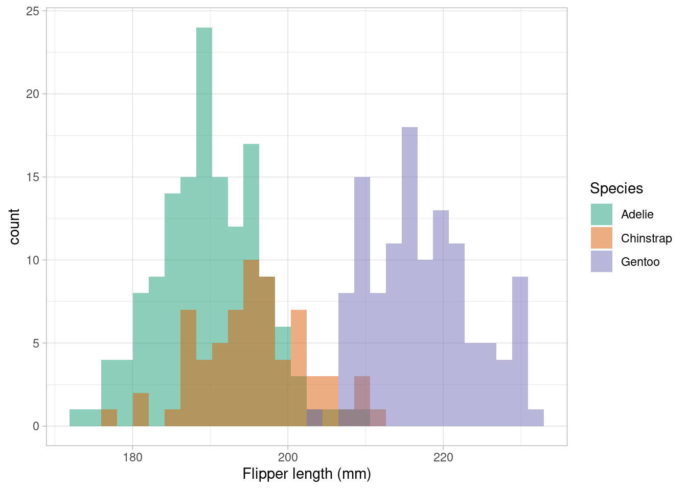
TASK
We should always avoid using similarly bight red and green colours: they may not be distinguishable for red-green colorblind readers. Using ggplot2 we can access a whole range of colourblind friendly palettes: one package that has a whole range is RColorBrewer install it then try running RColorBrewer::display.brewer.all(colorblindFriendly = TRUE) what do you think you’ve asked your computer to show you?
We’ve seen that there are three factor variables in the dataset: species, island, and sex. To count the number of penguins of each species and sex on each island we could use the following pipeline.
penguins_nafree %>%
  count(species, sex, island)
## # A tibble: 10 × 4
##    species   sex    island        n
##    <fct>     <fct>  <fct>     <int>
##  1 Adelie    female Biscoe       22
##  2 Adelie    female Dream        27
##  3 Adelie    female Torgersen    24
##  4 Adelie    male   Biscoe       22
##  5 Adelie    male   Dream        28
##  6 Adelie    male   Torgersen    23
##  7 Chinstrap female Dream        34
##  8 Chinstrap male   Dream        34
##  9 Gentoo    female Biscoe       58
## 10 Gentoo    male   Biscoe       61
However, it’s not too easy to compare the raw numbers here; so what about a bar graph?
ggplot(penguins_nafree, aes(x = species, fill = sex)) +
  geom_bar(alpha = 0.8, position = "dodge") +
  facet_wrap(~island) + ## what are we doing here?
  xlab("") +
  theme_linedraw() + ## remember themes...
scale_fill_manual(values = c("cyan4","darkorange"), name = "Sex") 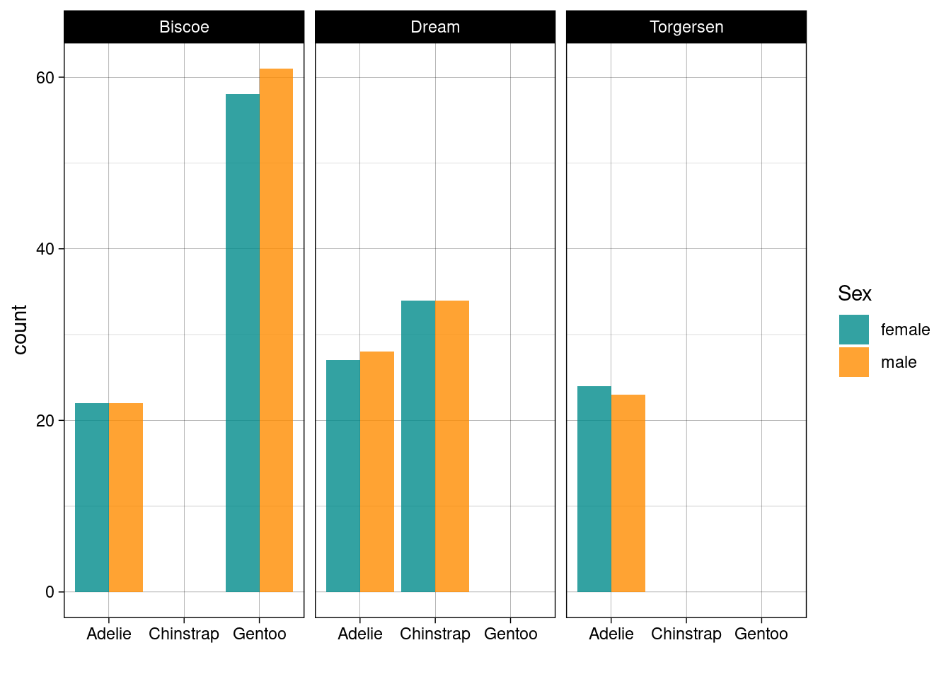
TASK Before reading the breakdown below write out your own and then compare the two.
Breaking down the code above we have
ggplot(penguins_nafree, aes(x = species, fill = sex))initializes the plot using theggplot()function, specifying the datasetpenguins_nafree. It maps the x-axis (x) to thespeciesvariable and fills the bars based on thesexvariable.geom_bar(alpha = 0.8, position = "dodge")adds a layer to the plot usinggeom_bar(). Thealpha = 0.8argument adjusts the transparency of the bars, andposition = "dodge"places the bars side by side for each species.facet_wrap(~island)creates a faceted plot where separate plots are generated for each level of theislandvariable.xlab("")sets the x-axis label as an empty string"".theme_linedraw()applies a linedraw theme to the plot.scale_fill_manual(values = c("cyan4", "darkorange"), name = "Sex")customizes the fill color scale and sets the colors for the two levels of thesexvariable assigning the legend title as"Sex".
TASK Run each code chunk below. Map each line to a component in the plot produced. Can you improve the plots?
ggplot(penguins_nafree,aes(x = species, y = flipper_length_mm)) + ## data & aesthetics
    geom_boxplot()  + ## geom
  ggtitle("Flipper length (mm) by species") +
  ylab("Flipper length (mm)") +
  xlab("Species") +
  theme_dark() ## theme
ggplot(penguins_nafree,aes(x = species, y = flipper_length_mm)) + ## data & aesthetics
    geom_jitter()  + ## geom
  ggtitle("Flipper length (mm) by species") +
  ylab("Flipper length (mm)") +
  xlab("Species") +
theme_dark() ## themeggplot(penguins,aes(x = species, y = flipper_length_mm)) + ## data & aesthetics
geom_violin() + ## geom
ggtitle("Flipper length (mm) by species") +
ylab("Flipper length (mm)") +
xlab("Species") +
theme_dark() ## themeggplot(penguins_nafree, aes(x = body_mass_g, y = flipper_length_mm,
col = species)) +
geom_point(size = 2, alpha = 0.5) +
geom_smooth(method = "lm", se = FALSE) +
facet_grid(~ sex) +
theme_bw() +
labs(title = "Flipper Length and Body Mass, by Sex & Species",
subtitle = paste0(nrow(penguins), " of the Palmer Penguins"),
x = "Body Mass (g)",
y = "Flipper Length (mm)")2.4 Bringing things together
2.4.1 More on pipelines and operators
In this chapter you’ve been introduced to the pipe operator %>% and the use of the + operator adding layers to a ggplot. Recall that %>% is used for chaining operations in a data manipulation pipeline, whilst + is used for adding layers to a plot in the ggplot2 framework. They serve different purposes, but we can combine them! For example, we can pipe a data object using %>% into a ggplot workflow and then use + to add layers.
library(tidyverse)
library(palmerpenguins)
penguins %>%
    na.omit() %>%
    filter(., island == "Biscoe" ) %>%
    ggplot(., aes(y = body_mass_g, x = species)) +
    geom_boxplot() +
    labs(title = "Penguin Body Mass by Species on Biscoe",
         y = "Body Mass (g)",
         x = "")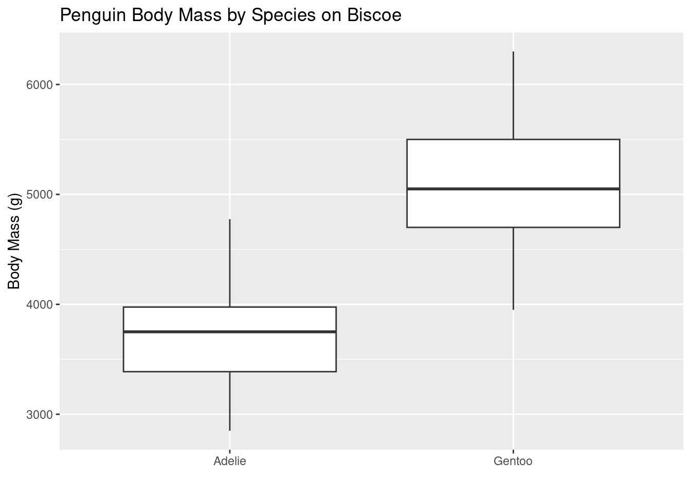
TASK Run the code below. It will give you an error, can you figure out what the cause is?
2.4.2 What to look at in a plot (a taster)
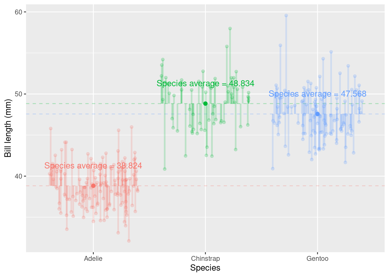
In many of the following chapters you will hear a lot about variability or variation. Variation is simply a measure of spread (i.e., how far apart the observations are from each other). In particular, we often talk about deviation from the mean (i.e., how far away from the average value the observations are) as we are often interested in how large this deviation is relative to the information we have. In Chapter 5 you will learn about ways of formally testing this. However, with the data visualization skills you’ve just learnt we can already begin to critically evaluate our data by simply looking at plots.
Between-group variation is a measure of the variability between different groups; it assesses how much the means of different groups differ from each other. Higher between-group variation suggests that the groups are not similar. However, before we can conclude anything relating to similarity, or not, of groups we also have to consider within-group variation.
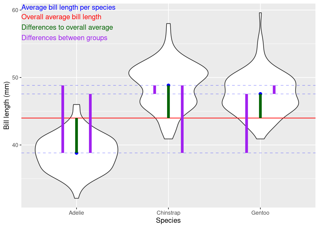
Within group variation measures the variability among individual data points within each group; it measures how much individual data points within each group differ from the group’s mean. Lower within-group variation suggests that the data points within each group are less scattered around the group’s mean
Other resources: optional but recommended
- Ihaka Lecture Series 2023 Danielle Navarro – Unpredictable paintings: Making generative artwork in R
- Ihaka Lecture Series 2023 Chris McDowall – What’s Behind the Map: The Process of Data Visualisation
-
ggplot2cheatsheet - Elegant Graphics for Data Analysis
-
Using
ggplot2to communicate your results - Teacups, giraffes, and statistics: free online introductory level R and statistics modules